how about the "worst" paint shemes
- Gov. Crappo
- Railroadfan...fan
- Posts: 656
- Joined: Sat Nov 22, 2008 12:09 pm
- Location: mp CH 45 Ply sub
how about the "worst" paint shemes
we did the one side now how about the other..
rusty faded primer etc etc not excepted...the worst regularly applied locomotive paint scheme...steam diesel or electric
i vote for
#1 "kodachrome" SP\SF
#2 ATSF "zebra stripe" early road switchers
#3 anything "PC" green
rusty faded primer etc etc not excepted...the worst regularly applied locomotive paint scheme...steam diesel or electric
i vote for
#1 "kodachrome" SP\SF
#2 ATSF "zebra stripe" early road switchers
#3 anything "PC" green
i hate the interstate and the infernal combustion engine
nothing is sweeter then the smell of coalsmoke in the morning
"hey are you waiting for a train too?"
nothing is sweeter then the smell of coalsmoke in the morning
"hey are you waiting for a train too?"
- MIGN-Todd
- Railroadfan...fan
- Posts: 425
- Joined: Thu Dec 04, 2008 3:35 pm
- Location: Traverse City, Michigan
Re: how about the "worst" paint shemes
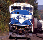
I've always disliked the Conrail blue or the GLC blue, the AT&SF striped scheme was hideous also. More than likely the silver and orange Western Pacific.
U.S.Army Retired- under new management (see wife)
- cnw8835
- Grain Train Fetish LOLZ
- Posts: 4736
- Joined: Sun Oct 29, 2006 6:19 pm
- Location: Grand Rapids, MI
- Contact:
Re: how about the "worst" paint shemes
Very easy, the worst has to be the Santa Fe red and silver Warbonnet. Gag me with a spoon!
- Gov. Crappo
- Railroadfan...fan
- Posts: 656
- Joined: Sat Nov 22, 2008 12:09 pm
- Location: mp CH 45 Ply sub
Re: how about the "worst" paint shemes
cnw8835 wrote:Very easy, the worst has to be the Santa Fe red and silver Warbonnet. Gag me with a spoon!
i hate the interstate and the infernal combustion engine
nothing is sweeter then the smell of coalsmoke in the morning
"hey are you waiting for a train too?"
nothing is sweeter then the smell of coalsmoke in the morning
"hey are you waiting for a train too?"
Re: how about the "worst" paint shemes
PC green and Conrail blue
- JANGAJONGA
- Epic Fail B34 Master
- Posts: 1685
- Joined: Wed Nov 19, 2008 3:35 pm
Re: how about the "worst" paint shemes
I think it is bnsfs barf bonnet schemes. It is grey black and disgusting.
- conrailmike
- Signal Maintainer
- Posts: 2832
- Joined: Tue Jan 30, 2007 9:59 pm
- Location: Less than 100' from CSX (LSRC) Saginaw Sub. MP 61.4 in Highland, MI
Re: how about the "worst" paint shemes
MIGN-Todd wrote:I've always disliked the Conrail blue...
hobojim wrote:...and Conrail blue
How dare you?! You guys need your mouths washed out for saying such filth!!
- SD80MAC
- Ingersoll's Mr. Michigan
- Posts: 10691
- Joined: Thu Mar 10, 2005 4:59 pm
- Location: Grand Rapids
Re: how about the "worst" paint shemes
Agreed!conrailmike wrote:MIGN-Todd wrote:I've always disliked the Conrail blue...
hobojim wrote:...and Conrail blue
How dare you?! You guys need your mouths washed out for saying such filth!!
I've never been a big fan of the CTA scheme on the F40's before the advent of METRA. Seaboard Airline green and gold was also pretty ugly.
"Remember, 4 mph is a couple, 5's a collision!"
http://flickriver.com/photos/conrail680 ... teresting/
Re: how about the "worst" paint shemes
Sorry Mike and Jon, but that shade of blue that conrail used is the only shade I dread to see.
I do think the Red/yellow of SP-SF aborted merger was ugly. Reminded me of the exterior paint job of an XXX movie house of the 70s, prior to the ready availibity of internet and VCR porn.
jim
I do think the Red/yellow of SP-SF aborted merger was ugly. Reminded me of the exterior paint job of an XXX movie house of the 70s, prior to the ready availibity of internet and VCR porn.
jim
- conrailmike
- Signal Maintainer
- Posts: 2832
- Joined: Tue Jan 30, 2007 9:59 pm
- Location: Less than 100' from CSX (LSRC) Saginaw Sub. MP 61.4 in Highland, MI
Re: how about the "worst" paint shemes
That's okay, to each his own I guess...hobojim wrote:Sorry Mike and Jon, but that shade of blue that conrail used is the only shade I dread to see.
I have to agree with you there, it was pretty ugly. It's funny, there's a bar over in Clarkston on Dixie Hwy. that has that exact paint scheme.hobojim wrote:I do think the Red/yellow of SP-SF aborted merger was ugly. Reminded me of the exterior paint job of an XXX movie house of the 70s, prior to the ready availibity of internet and VCR porn.
- MIGN-Todd
- Railroadfan...fan
- Posts: 425
- Joined: Thu Dec 04, 2008 3:35 pm
- Location: Traverse City, Michigan
Re: how about the "worst" paint shemes
I'll give you my reasoning for the blue. Too light of a color I believe and it was just too basic (design). I liked the logo on the side but the overall scheme was too blah. Forgive me guys, I'm sorry.
U.S.Army Retired- under new management (see wife)
Re: how about the "worst" paint shemes
The KCS gray units, there so boring and seeing the LSRC engines all the time is not helping......
Re: how about the "worst" paint shemes
Yes , The Deer Lake Inn, they just repainted it this summer and I wondered if they were going to a XXX bar.conrailmike wrote:That's okay, to each his own I guess...hobojim wrote:Sorry Mike and Jon, but that shade of blue that conrail used is the only shade I dread to see.
I have to agree with you there, it was pretty ugly. It's funny, there's a bar over in Clarkston on Dixie Hwy. that has that exact paint scheme.hobojim wrote:I do think the Red/yellow of SP-SF aborted merger was ugly. Reminded me of the exterior paint job of an XXX movie house of the 70s, prior to the ready availibity of internet and VCR porn.
I use the credit union next door to it.
- conrailmike
- Signal Maintainer
- Posts: 2832
- Joined: Tue Jan 30, 2007 9:59 pm
- Location: Less than 100' from CSX (LSRC) Saginaw Sub. MP 61.4 in Highland, MI
Re: how about the "worst" paint shemes
You'd have to be blind to miss the place!hobojim wrote:Yes , The Deer Lake Inn, they just repainted it this summer and I wondered if they were going to a XXX bar.conrailmike wrote:That's okay, to each his own I guess...hobojim wrote:Sorry Mike and Jon, but that shade of blue that conrail used is the only shade I dread to see.
I have to agree with you there, it was pretty ugly. It's funny, there's a bar over in Clarkston on Dixie Hwy. that has that exact paint scheme.hobojim wrote:I do think the Red/yellow of SP-SF aborted merger was ugly. Reminded me of the exterior paint job of an XXX movie house of the 70s, prior to the ready availibity of internet and VCR porn.
I use the credit union next door to it.
- M.D.Bentley
- Railroadfan...fan
- Posts: 2477
- Joined: Sat May 07, 2005 4:41 pm
- Location: Downriver
Re: how about the "worst" paint shemes
Hated the NW black , but loved it on the PC units.
- amtrakjackson
- Deactivated
- Posts: 520
- Joined: Tue Mar 01, 2005 11:43 am
- Location: outside Jackson, MI
- Contact:
Re: how about the "worst" paint shemes
#1) BNSF "Heritage II" and the current, um, offering. Loved the first try ("Heritage I"); it's one of my favorites. But you can keep the later s***.
#2) Santa Fe silver and red. Too garish and gaudy.
#3) GTW Blue
#4) Railamerica red/silver/blue/white
#5) ICG orange/white
#6) GLC and TSBY in its later incarnations
#7) CSX early schemes, pre-1990
#8) Amtrak Phase I and II. Ugh. Phase V ain't much better.
#9) Aberdeen & Catfish LMFAO
All in all, however, they aren't any different. It's all surface stuff that only matters to buffs. ANY paint scheme looks good to me!!!
Re: how about the "worst" paint shemes
Concerning #1, BNSF. I loved the Heritage 1 but also dislike 2 & 3 in contrast to 1.
the warbonnet is a classic but thanks to Lionel in the 50s it became the most commonly recognized design, hence it is blase to me. Although the first time I saw it for real was a thrill.( Temple Texas in 1963)
-
- Roadmaster
- Posts: 4762
- Joined: Fri Dec 23, 2005 9:12 am
- Location: Grand Rapids, MI
Re: how about the "worst" paint shemes
[quote="amtrakjackson
#6) GLC and TSBY in its later incarnations
All in all, however, they aren't any different. It's all surface stuff that only matters to buffs. ANY paint scheme looks good to me!!![/quote]
TSB isn''t gonna like that.................
#6) GLC and TSBY in its later incarnations
All in all, however, they aren't any different. It's all surface stuff that only matters to buffs. ANY paint scheme looks good to me!!![/quote]
TSB isn''t gonna like that.................
Re: how about the "worst" paint shemes
My least favorite scheme is probably Railamerica Red and Grey with reporting marks. 2nd is gonna be BNSF H3. How they can call that Heritage 3 is beyond me. The only thing Heritage about it is the Orange and Green.
-
- Sofa King follower
- Posts: 6159
- Joined: Sat Apr 23, 2005 1:59 pm
- Location: Toledo, OH.
Re: how about the "worst" paint shemes
Heritage 3 is Orange and Black, there is nothing heritage about it.
https://flic.kr/ps/jSuAb My Flickr photos!